
Commonly, typography is the style and arrangement of written language. It is used widely in design to create tone in order to seamlessly assist in potraying meaning. While today we don’t consciously recognise typography as major in everyday life, when we look back in time society is able to further understand the process of creating todays mass-produced presswork. Eskilson’s (2012) book “The Nineteenth Century: An Expanding Field” highlights the history of typography and design, in which has shaped todays world.
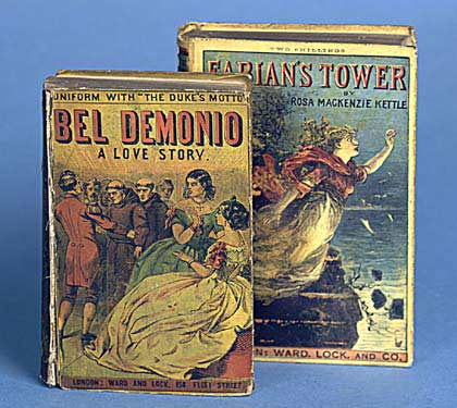
After WW1 extreme advertising and commercialism began due to the Industrial Revolution which saw a huge boom to mass-production, innovation, trade and the printing industry. 19th century advertising in Europe included an overuse of posters, billboards and other printed elements as they were inexpensive and could be easily mass-produced. Sans Serif was the main type used for advertising and posters as it was bold and large. The chaotic nature of advertisements made the Victorian age of design somewhat confusing. Mass production of books became successful in the form Yellow-backs in Victorian England as they were cheap and largely accessible for the mass market. In turn people become much more literate. Newspapers then soon developed to be the beginning of urban mass culture.
Before Art Nouveau theorists in the 19th Century were criticised for their lack of depth in their design theories. Such theorists like Augustus Welby Northmore Pugin, a British architect, designer, critic and artist was amongst those of whom were not celebrated. Yet culture and religion often influenced the poor nature and judgment of 19th century design theorists especially in relation to styles like gothic. It is also important to note that British colonisation played an important role in Victorian design. Pugin and other design influencers and theorists were interested in typical historical design styles. However some designers used Western culture and styles as a muse. This shift caused friction within the realm of design in the 19th century.
Conclusively, the mechanisation of type in the form of Linotype, Monotype and colour was a considerable development in graphic design and visual communication. While 19th century design can be viewed as a chaotic period, it was also a huge catalyst for social change.
By Chelsea Buswell.


References:
Eskilson, S. (2012) “The Nineteenth Century: An Expanding Field”, in Eskilson, S. Graphic Design: A History, London: Laurence King. pp24-50
Clarke, A. (2012) “12 Typography Guidelines For Good Website Usability”, Available at: https://usabilitygeek.com/12-typography-guidelines-for-good-website-usability/ Accessed: 8 August 2018.
Art & Design Culture, FlightPattern, Available at: http://flightpattern.net/2010/08/30/aaron-horkeys-midwestern-heart-solo-exhibition/ Accessed: 8 August 2018.
wellsbookartscenter, 2013, “Yellow-Back”, Available at: https://wellsbookartscenter.org/2013/10/09/yellow-back/ Accessed: 8 August 2018.
WikiMedia Commons, 2018, File: Linotype 2 imagee ameliorate.jpg – Wikimeadia Commons, Available at: https://commons.wikimedia.org/wiki/File:Linotype_2_imagee_amelioree.jpg, Accessed: 8 August 2018
