Week 6 Reading: Publicity and Design

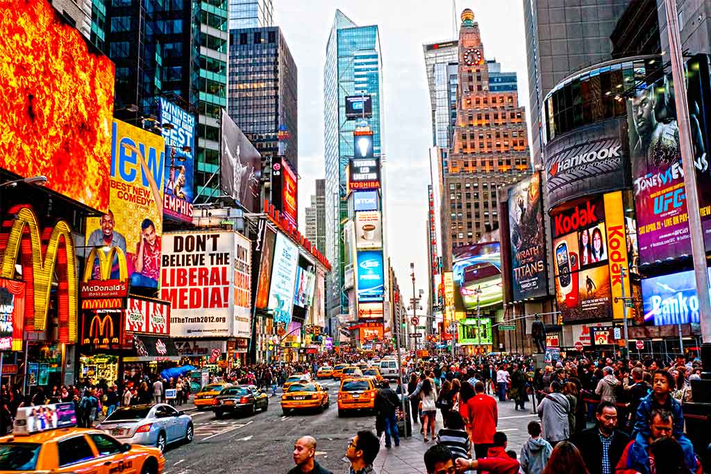
Berger (1990) discusses how even from a young age the sensory function of sight is a large determinant in forming our ideas about the world. However as we develop and become more consciously aware it is clear that there is a growing paradox between what we see and what we know or what is true.

Publicity offers a seemingly obtainable form of pleasure within the product/service being  advertised. This often incises people by appealing to a desired experience through creating envy. Spectators then manufacture their own dreams in connection to the meaning and voice portrayed through publicity. This ability to produce want and desire from a product/service is difficult because it requires creators to fabricate disappointment within their target audience.

Berger (1990) also raises ideas regarding the spectator in publicity. A spectator in comparison to a buyer cannot access the product. For example a spectator would go to an art gallery to view art whereas a buyer would purchase art and display it in their own home. This illuminates the social constructs and authority of not only publicity but also society. Through publicity we gain insight into social class, democracy and capitalism. Capitalism survives through successful trade and industry. Therefore strong publicity enables high production, contributing to an increased economy. Publicity serves capitalism by designing a false standard of what is and what is not desired. Society is bombarded everyday with publicity and because of this high saturation the public is given choice. Hereby a form of democracy is created through freedom of choice.

Subsequently, publicity is full of hidden and explicit meaning, in which society does not always notice the impact. Berger (1990) highlights that publicity is a language of its own and connects to all aspects of society. However there will always be a gap between publicity and what is promises its consumers.

By Chelsea Buswell.


References:

Berger, J. (1990), “7” in Berger, J. Ways of Seeing. London, Penguin, pp 129 – 156
Week 5 Reading: Photography

As discussed by Barthes (1982) early photography was difficult for people to comprehend  as the source of the and the fact that it could be repeated confused society. This then caused many authenticity debates because prior to photography the main form of capturing an image was painting, which saw a person physically replicating an image. Thus unlike the process of painting whereby there is a physical process, photography produced only an output, baffling society.

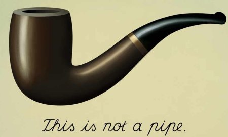
Overtime this confusing developed into a greater complication. While photography shows what is certain, is a picture of something really that thing? Take Surrealist artist René Magritte’s (1928) painting of a pipe for instance. Is it truely a pipe or is it merely a painting of a pipe? Of course it is a painting, yet the meaning in Magritte’s work can be applied to photography. When we take a photo of an object, person or environment there is always going to be a conflict of experience verses image. For example, is there a difference between going to see the Eiffel Tower in real life compared to seeing an image? Realistically it depends on the object, person or environment itself however the idea raises valuable questions about authenticity and photography.

Regardless of your position on the subject it is evident that photographs can still portray a high level of meaning. Bathes (1982) highlights that often people can find it difficult to recognise the meaning of photographs and while there is no physical thing there is a narrative to the image. Bathes (1982) also recognises that amateur photography is seeing the image but not the meaning as he illuminates in the words “a photograph is always invisible; it is not what we see” (p.g 6).

By Chelsea Buswell.

this_is_not_a_pipe_by_sayla59-d817eld
Rene Magritte (1928)

References:

Barthes, R. (1982), Camera Lucida, New York Hill & Wang, pp 3 – 10

All, P. (2018) Freezing the Moments by Capturing in Photography. Available at: http://www.portraitsall.com.au/freezing-moments-capturing-photography/ (Accessed: 31 August 2018).

this is not a pipe by Sayla59 on DeviantArt (2014). Available at: https://www.deviantart.com/sayla59/art/this-is-not-a-pipe-485754529(Accessed: 31 August 2018).

Week 5: Painting is Dead?

Painting was the main and only form of ‘authentic’ visual representation before photography was invented. Portrait paintings were also a symbol of social class and were considered a fine art. Thus prior to the 18th century painting was a large part of society.

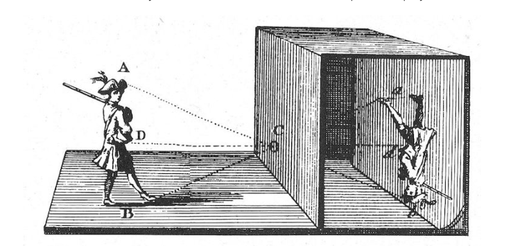
The first forms of ‘camera’ was Camera Obscura and the Pinhole Camera in the 17th and 18th century (Steward, 2018). These were very similar devices, in which used the projection of light through a hole in a wall onto the other side of the screen or wall. Such methods required a large space and consequently there was no way to preserve the image. While Camera Obscura and Pinhole Camera threatened the work of painters, painters were able to maintain their craft through the preservation element of painting.

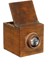
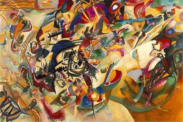
Heliography was the next major innovation within the realm of photography. Created by Frenchman Nicephore Niepce in 1816, Heliography was essentially a wooden box with a microscopic lens. It used bitumen as a coating on the surface, which hardened due to exposure. This was a major advancement as the product was permanent.  As this became at height, it offered a more efficient way of capturing images. During the time between Heliography and the first SLR camera being invented, painters felt that their occupations and fine position in society was deeply threatened due to the mass production that resulted from innovations with cameras. However, instead this actually allowed painters to begin to explore more expressive forms of art. Hence this is how modern art movements have been devised.

While today mobile phones have allowed images to be captured and shared instantly, painting is still not dead. Painters may not have the same role that they did prior to the 18th century but it still holds a position within society. Art and design has changed but is the same in the sense that it allows abstract ideas to be explored in ways that photography cannot. While greater experimentation has occurred in photography from abstract art they both compliment and challenge one another.

By Chelsea Buswell.

Screen Shot 2018-08-30 at 1.28.18 pm
Camera Obscura
Screen Shot 2018-08-30 at 2.01.16 pm
Heliography
main-qimg-0761887bace562d39ab315c54adc6339-c
Example of Modernist Painting (Wassily Kandinsky, 1913)

References:

Steward, J. (2018). Who Invented the Camera? A Lesson in the History of Photography. Available at: https://mymodernmet.com/who-invented-the-camera-photography-history/ (Accessed: 30 August 2018).

Nicephore Niepce and Heliography (2009). Available at: http://www.curious-eye.com/photography_pg2.php (Accessed: 30 August 2018).

Greg Gandy | Still Life with Dead Roses (2014) | Artsy. Available at: https://www.artsy.net/artwork/greg-gandy-still-life-with-dead-roses (Accessed: 30 August 2018).

What are the characteristics of modernist art? – Quora (2014). Available at: https://www.quora.com/What-are-the-characteristics-of-modernist-art (Accessed: 30 August 2018).

Week 4 Reading: Isotype

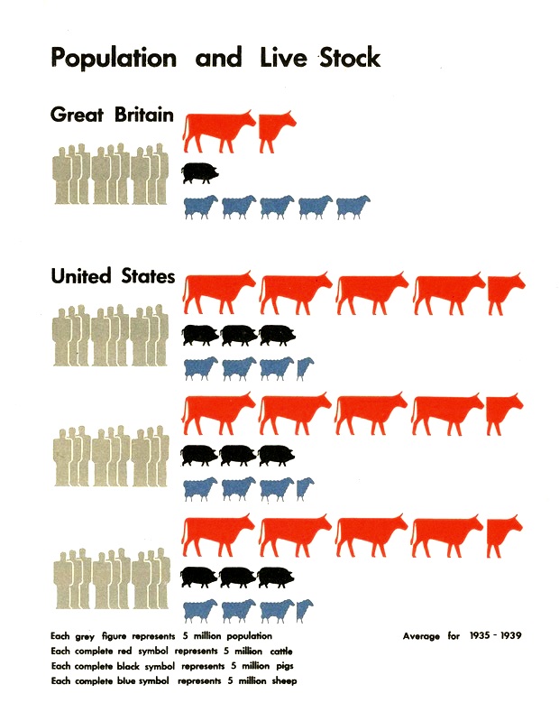
Formerly known as The Vienna Method of Pictorial Statistics, Isotype was invented by Otto Neurath (1882-1945) and his team in the first few decades of the twentieth century (Janson, W. 2009). Neurath was an economist whom believed strongly in statistics and the interoperation of information (Burke, C. 2009). Thus Neurath’s aim became to produce clear pictograms that could be easily conveyed regardless of ones educational background.

During the late nineteenth century and early twentieth century there was a strong emphasis on cultural and educational projects. In the 1940s and 50s Isotype was employed within countries like the Netherlands, Great Britain, Greece, the USA (Janson, W. 2009). However the work of Neurath and his team has had a lasting impression within the realm of art and design in contemporary society. In 2008 artists Alice Creischer and Andreas Siekmann worked at the University of Lüneburg transforming 1930 Isotype maps into modern designs (Janson, W. 2009). One of their major projects was in 2008 whereby Creisher and Siekmann created a map of Dubai for urban development. As such Isotype and the idea of pictograms is still used today to represent graphical statistics but also has been developed to new areas such as architecture.

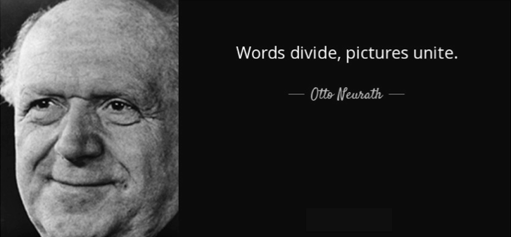
“Words divide, pictures unite” (Burke, C. 2009. p.g 2) was how Neurath described the importance of Isotype. It explains that while words cannot always be understood by every individual based on social differences like education level or language, pictures easily depict meaning. Therefore while Neurath’s contribution to visual communication is extraordinary, he has also defied social barriers and assisted in globalising the world.

By Chelsea Buswell.

example2.jpg
Example of Neurth’s Isotype

References:

Burke, C. (2009). Isotope Representing Social Facts Pictorially. In: Data Designed for Decisions. Paris.

Janson, W. (2009). Neurath, Arntz and ISOTYPE: The legacy in art, design and statistics: Discovery Service for Univ of Newcastle. Available at: http://eds.b.ebscohost.com.ezproxy.newcastle.edu.au/eds/detail/detail?vid=0&sid=09bd1564-8fdc-4d95-ae76-677eaaf5a65b%40pdc-v-sessmgr04&bdata=JnNpdGU9ZWRzLWxpdmU%3d#db=edselc&AN=edselc.2-52.0-76049093081 Accessed: 22 August 2018.

Otto Neurath Quote. 2018. AZ Quotes. Available at: https://www.azquotes.com/quote/678935 Accessed: 23 August 2018.

ISOTYPE Visualization. Available at: http://steveharoz.com/research/isotype/ Accessed: 23 August 2018.

Week 4: Gerd Arntz

Gerd Arntz (1900-1988) was most well known for his collaboration with Otto Neurath, in which they designed a pictorial system used for knowledge and information transfer (Arntz, G. 2010). This system was originally called the Vienna Method but is now referred to as Isotype. Due to such significant work, Gerd Arntz is renowned in the world of visual communication.

Prior to his work with Neurath at the Vienna Museum of Society and Economy, Arntz study at an art acsemdy in the early 1920 to become a drawing teacher. He also belonged to the ‘progressive artist group’ (Arntz, G. 2010) whereby he focused on social and political issues through his art. This attracted the attention of Neurath through an exhibition in Germany. In 1928 Arntz was invited to Vienna to further develop Neurath’s Isoype theory, where he was later assigned as a design director. The role was ideal for Arntz as he was able to practise his political beliefs in a way that would actively inform. In 1930, ‘Gesellschaft und Wirtschaft’ was published and the collection of 100 visual statistics was a major success (Arntz, G. 2010).  After the Nazi take over in 1934, Arntz emigrated to the Netherlands and continued working on Isotype, where he would soon work for the Dutch Foundation of Statistics. In the Netherlands he also created a series of prints regarding the threat of Nazism, evidently showcasing his social and political views.

Arntz developed the Isotype visual dictionary, consisting of over 4000 symbols, allowing society to follow a simplistic and informative system. With an artistic career of 50 years and a lifetime of societal and political ideologies, Arntz was in many ways was an influential activist as well as a successful contributor to visual communication.

By Chelsea Buswell.


schermafbeelding-2017-04-29-om-16-24-21
Gerd Arntz

References:

gerd arntz. (2010). Available at: https://popupdynamics.wordpress.com/tag/gerd-arntz/ Accessed: 22 August 2018.

Arntz, G. (2010) Gerd Arntz. 010 Publishers.

FTN-Blog. (2017) Gerd Arntz (1900-1988). Available at: https://ftn-blog.com/2017/04/29/gerd-arntz-1900-1988/ Accessed: 22 August 2018.

Week 3 Reading: Modernism and The Bauhaus

During the late 19th century to mid 20th century Modernism was characterised by clean, abstract, geometric forms with the use of modern materials. This powerful expression was associated with social, moral and political agendas such as feminism, in which was not confined by national boundaries (Woodham, 1997). Modernism had a global affect even reaching Germany through the opening of the Bauhaus Art School in 1919 founded by Walter Grapius. Expressionism and creative experimentation was the main focus during a time when creativity was low and propaganda and economic crisis was prominent (Smith, 2005).

However the Bauhaus’ original intent was eventually corrupted when conflicting personalities such as Theo Van Doesbury, a Dutch artist whom led the group De Stijl arrived in 1921 (Smith, 2005).  He began to encourage criticism of the Bauhaus through organising independent classes exclusively for Bauhaus students. This created a conflicting purpose at the Bauhaus between the ideals of Grapius and De Stijl. Thus during the next fourteen years of it’s existence the Bauhaus had a huge lack of direction.

While the Bauhaus was one of the key educational design institutions in Europe and played an integral role in the spread of modernism, the school was forced to close in 1939 (Woodham, 1997). This was due to the strong oppressive force of the German political group the Nazi’s. This cultural repression resulted from the large amounts of Jewish staff, female students and the modern values of the school. Therefore it was seen as a threat to the Nazi’s political values (Willette, 2016).

By Chelsea Buswell.

The-Bauhaus
The Bauhaus Germany


References:

Woodham, J. M. (1997) “Design and Modernism” in Woodham, J. M. Twentieth Century Design, Oxford & New York: Oxford University Press. pp29-63

Smith, V. (2005) “Chapter 2: The Bauhaus”, Forms in Modernism: The Unity of Typography, Architecture & the Design Arts 1920s-1970s, pp. 30–53. Available at: http://ezproxy.newcastle.edu.au/login?url=http://search.ebscohost.com/login.aspx?direct=true&db=asu&AN=28545986&site=ehost-live&scope=site ,Accessed: 16 August 2018.

Willette, J. (2016) Bauhaus: The End | Art History Unstuffed. Available at: https://arthistoryunstuffed.com/bauhaus-the-end/ ,Accessed: 17 August 2018.

theartist, A. (2017) The Bauhaus. Available at: https://davidcharlesfox.com/bauhaus-german-art-movement/ ,Accessed: 17 August 2018.

What is Modernism. (2018) Composition III, Wassily Kandinsky. Available at: https://osnatfineart.com/articles/modernism.php ,Accessed: 17 August 2018.

Week 3: Soviet Russia and Design

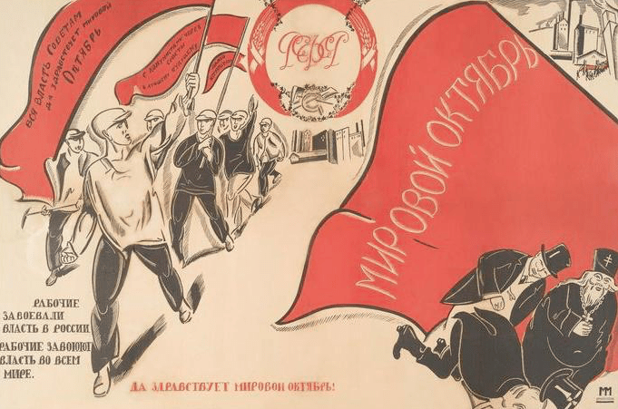
Due to the heavy impact and threat of WW1, propaganda became the main source of visual communication in order to recruit troops, create patriotism and guilt and develop information design. This sparked social influence as varieties of propaganda were created to appeal to different people and emotions. In the most unlikely way propaganda played a major role in revolutionising graphic design and resulted in experimentation and innovation in Soviet Russia.

Soviet Russia was one of the most interesting countries when it comes to design during the WW1 and WW2 and in the postmodernism phase. During WW1 constructivism and constructivists gained momentum whereby unique work was rejected. Russia preferred mass produced goods and materials and creative output in Russia was considered to be a product of the state. Propaganda in Soviet Russia during WW1 included bold typography and a reduced colour palette using red, white and blacks. In WW2 Soviet Russian advertising campaigns reflected state ideologies and was extremely political. This included communist symbols and Marxist slogans and thus propaganda was a tool of power.

During the postmodernist period in the 1970s in Soviet Russia, Senezh Studio was a design school of the Union that focused on bringing new elements to Russian design such as semiotics, environment, and the uses of history and memory (Cubbin, 2017). Local expression and the existence of historic buildings in Soviet cities was threatened due to the principles of urban design. As such the designers at Senezh Studio attempted to relieve such pressures. Designers produced work that spanned industrial design, urbanism, model making, exhibition design and fine art in an attempt to challenge design thinking and culture more broadly.

Conclusively, Soviet Russia went through a major evolution between WW1 and the postmodern era. While design was conformed and strict, the ideology and history is interesting as this played a major role in structuring Russian design. WW1 and WW2 propaganda and Senezh designers were instrumental in the development of a critical and political discourse within Soviet design (Cubbin, 2017).

By Chelsea Buswell.

Screen Shot 2018-08-15 at 9.31.49 am.png
Soviet Russian Propaganda

References:

Cubbin, T, 2017, Postmodern Propaganda? Semiotics, environment and the historical turn in So…: Discovery Service for Univ of Newcastle,  Available at: http://eds.b.ebscohost.com.ezproxy.newcastle.edu.au/eds/detail/detail?vid=0&sid=193fc102-7d08-4124-bf82-82e9838ca0f4%40pdc-v-sessmgr01&bdata=JnNpdGU9ZWRzLWxpdmU%3d#AN=000397208400002&db=edswah , Accessed: 14 August 2018.

Collectors’ guide: 1920s Soviet propaganda posters, Christie’s, 2015, Available at: https://www.christies.com/features/Russian-posters-the-art-of-propaganda-6141-1.aspx Accessed: 14 August 2018.

Russian Propaganda during WWI, 2011, Available at: https://worldwaripropaganda.wordpress.com/2011/01/24/russian-propaganda-during-wwi/ ,Accessed: 15 August 2018.


Week 2: Print and Photography

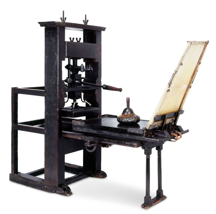
Before todays automated press different people and cultures had a variety of ways for producing text. Earlier press began in China, in which woodblocks were used to create characters for books. This process was slow and the woodblocks would wore out quickly. Then in 1915 came the start of mass produced press with Johannes Gutenberg inventing the Gutenberg Press. As this type was metal and movable it was not only faster at printing but the metal could withstand constant use. Prior to the Gutenberg press most people were illiterate and thus this was the beginning for the renaissance of graphic design. Over the past 20 years mass production print media has been declining. Todays threat is the rise of digital journalism and the flow of information through the Internet (Evgeny, 2016). Newspapers once were the main source of societies information. Now with the convenience of digital media, newspapers have become impractical and an unnecessary expense.

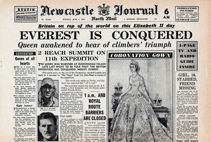
The invention of photography was another momentous event, in which changed society. It all started with Camera Obsecura in the 13th Century. Camera Obsecura was a photo preservation device and thus it still took many more centuries to develop todays cameras and phones. Early photography raised questions of authenticity as people were uncertain of how what was usually the work of painters could be imitated. This new form of representation could be viewed as the killer of fine art, whereby artists in the 19th century were now exploring new revenues of work that could not be recreated through photography. These styles included expressionism. Nevertheless, 19th century society didn’t have the larger issue of the Internet. From classical media to todays digital era society faces new concerns. Almost anyone can be their own author/artist with social platforms such as Instagram allowing users to create their own content and publish it. Through these platforms images can be altered through the means of filters and photoshop. Stock photos also add this element of uncertainty regarding authenticity. Images today are extremely mass produced and widley saturated that we don’t consciously question if it is real or not. However in this digital era whereby material can be mass produced and circulated easily, society must be more cautious and aware especially in regards to privacy and integrity of information.

As such it is clear that both mass produced print and photography have changed time. But these mediums have also changed throughout time and thus so have the experiences of society.

By Chelsea Buswell.

U48P5029T2D461785F34DT20120425172042
Chinese Woodblocks
MA_00009105_wal0vg
Gutenberg Press
artist-using-camera-obscura
Camera Obscura


References:

Tolmachev, I. 2010, “A History of Photography Part 1: The Beginning”, Available at: https://photography.tutsplus.com/articles/a-history-of-photography-part-1-the-beginning–photo-1908 , Accessed: 10 August 2018.

Evgeny V. Akhmadulin, 2016, “Print Mass Media: Territory of Survival”, Ûžnogo Federalʹnogo Universiteta: Filologičeskie Nauki, Vol 2016, Iss 3, Pp 156-160, Accessed 10 August 2018.

“Artist using camera obscura”, 2012, Available at: https://aehistory.wordpress.com/1700/01/01/1700-camera-obscura-in-drawing-process/artist-using-camera-obscura/ , Accessed: 10 August 2018.

“Woodblock printing workshop in E. China” – Lifestyle News – SINA English, 2012, Available at: http://english.sina.com/life/p/2012/0425/461785.html , Accessed: 10 August 2018.

“How is a book made?” 2018, Available at: https://www.dkfindout.com/uk/more-find-out/special-events/how-is-book-made/ , Accessed: 10 August 2018.

Maxey, M. “1953 newspaper headlines | NEWSPAPER HEADLINES etc : Old Newspaper articles from times past in”, Pinterest, Available at: https://www.pinterest.co.uk/pin/562950022142201766/ , Accessed: 10 August 2018.

Week 2 Reading: Typography

Commonly, typography is the style and arrangement of written language. It is used widely in design to create tone in order to seamlessly assist in potraying meaning. While today we don’t consciously recognise typography as major in everyday life, when we look back in time society is able to further understand the process of creating todays mass-produced presswork. Eskilson’s (2012) book “The Nineteenth Century: An Expanding Field” highlights the history of typography and design, in which has shaped todays world.

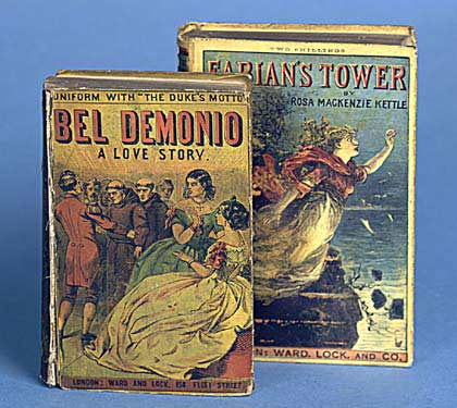
After WW1 extreme advertising and commercialism began due to the Industrial Revolution which saw a huge boom to mass-production, innovation, trade and the printing industry. 19th century advertising in Europe included an overuse of posters, billboards and other printed elements as they were inexpensive and could be easily mass-produced. Sans Serif was the main type used for advertising and posters as it was bold and large. The chaotic nature of advertisements made the Victorian age of design somewhat confusing. Mass production of books became successful in the form Yellow-backs in Victorian England as they were cheap and largely accessible for the mass market. In turn people become much more literate. Newspapers then soon developed to be the beginning of urban mass culture.

Before Art Nouveau theorists in the 19th Century were criticised for their lack of depth in their design theories. Such theorists like Augustus Welby Northmore Pugin, a British architect, designer, critic and artist was amongst those of whom were not celebrated. Yet culture and religion often influenced the poor nature and judgment of 19th century design theorists especially in relation to styles like gothic. It is also important to note that British colonisation played an important role in Victorian design. Pugin and other design influencers and theorists were interested in typical historical design styles. However some designers used Western culture and styles as a muse. This shift caused friction within the realm of design in the 19th century.

Conclusively, the mechanisation of type in the form of Linotype, Monotype and colour was a considerable development in graphic design and visual communication. While 19th century design can be viewed as a chaotic period, it was also a huge catalyst for social change.

By Chelsea Buswell.

Unknown
Linotype Machine
yellow-back
Yellow-Back Books
MWHeartvintage
19th Century Poster


References:

Eskilson, S. (2012) “The Nineteenth Century: An Expanding Field”, in Eskilson, S. Graphic Design: A History, London: Laurence King. pp24-50

Clarke, A. (2012) “12 Typography Guidelines For Good Website Usability”, Available at: https://usabilitygeek.com/12-typography-guidelines-for-good-website-usability/ Accessed: 8 August 2018.

Art & Design Culture, FlightPattern, Available at: http://flightpattern.net/2010/08/30/aaron-horkeys-midwestern-heart-solo-exhibition/ Accessed: 8 August 2018.

wellsbookartscenter, 2013, “Yellow-Back”, Available at: https://wellsbookartscenter.org/2013/10/09/yellow-back/ Accessed: 8 August 2018.

WikiMedia Commons, 2018, File: Linotype 2 imagee ameliorate.jpg – Wikimeadia Commons, Available at: https://commons.wikimedia.org/wiki/File:Linotype_2_imagee_amelioree.jpg, Accessed: 8 August 2018

Week 1: Exploring Visual Language

Visual language is the centre of design. Unknowingly through cultures such as Monks, the Ancient Egyptians and Indigenous Aboriginal people design practise was born in the form of visual language. This occurred through the creation of paintings, carvings and doodles. This is a representation of humanity as these early forms of visual language demonstate the human nature of expression. Such mediums are still carried out today. Perhaps not on the walls of caves, but daily society is bombarded with many different forms of visual language from pop-up advertisements on YouTube to the simple high-school desk engraving “Mark was here 2007”. Evidently all forms of visual language have significance and based on an individuals context the meaning and function of the visual medium will differ.

Visual language is a broad mode of communication. It can encompasses art, pictograms, pictographs, fossils, magazines, movies, the list continues. However due to technology, the saturation of visual language has been heightened and revolutionised. Emojis are one of the latest and most widely used forms of visual language by the general public. According to ADWEEK “92% of online consumers use emojis” (Shaul, 2015). Emojis foster expression by allowing the user to accurately represent their thoughts or feelings without words. As Hamza Alshenqeeti (2016) analysed, similarities between emojis and hieroglyphics and cuneiform can be drawn. This devises that emojis are not a new language, but are rather a digital communication addition adapted from an evolution of older visual language. This is interesting as humans have descended back to ancient and medieval times using non-verbal commuication rather than an alphabetised language. Subsequently, such symbols can be recognised and interpreted by different cultures allowing users to express tone and intent to others globally.

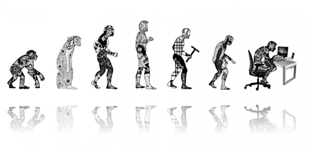
Examining visual language generates fascinating details regarding humanity and communication. Within 21st Century Western society we claim to be highly evolved. However when examined microscopically it is certain that today we are not so indifferent from those that walked this Earth millions of years ago. Design has emerged from the foundation of basic visual language and communication into a profession and/or personal hobby, in which has many different revenues. As such these visual language fundamentals are instilled and used everyday within society.

By Chelsea Buswell.


References:

Antonia, G 2017, “Back the future: From Hieroglyphics to Emojis — The full revolution of the image”, Available at: https://medium.com/@gaialondon/back-to-the-future-from-hieroglyphics-to-emojis-the-full-revolution-of-the-image-2a17c0c7daef viewed 7 August 2018.

Shaul,B 2015, ‘Report: 92% of Online Consumers Use Emoji ‘ (Infographic), Available at: https://www.adweek.com/digital/report-92-of-online-consumers-use-emoji-infographic/  viewed 7 August 2018.

Alshenqeeti, H 2016, ‘Are Emojis Creating a New or Old Visual Language for New Generations? A Socio-Semiotic Study’, Advances In Language And Literary Studies, 7, 6, pp. 56-69, ERIC, EBSCOhost, viewed 7 August 2018.